2019
Meetvio Visual Design
Product Design
Meetvio is a webinar platform built for internet marketers. Meetvio is part of the Vio group of products that includes, Membervio, Funnelvio, and Spyvio.
Meetvio needed a redesign as they moved out of the internet marketing space. I lead the visual design with one thing in mind; improve user experience but retain functionality. Basically, I could not change or introduce new features to improve user experience but redesign the original UI without changing the backend. There were some instances when I had to convince the product owners to add small features that could have a massive effect on UX.
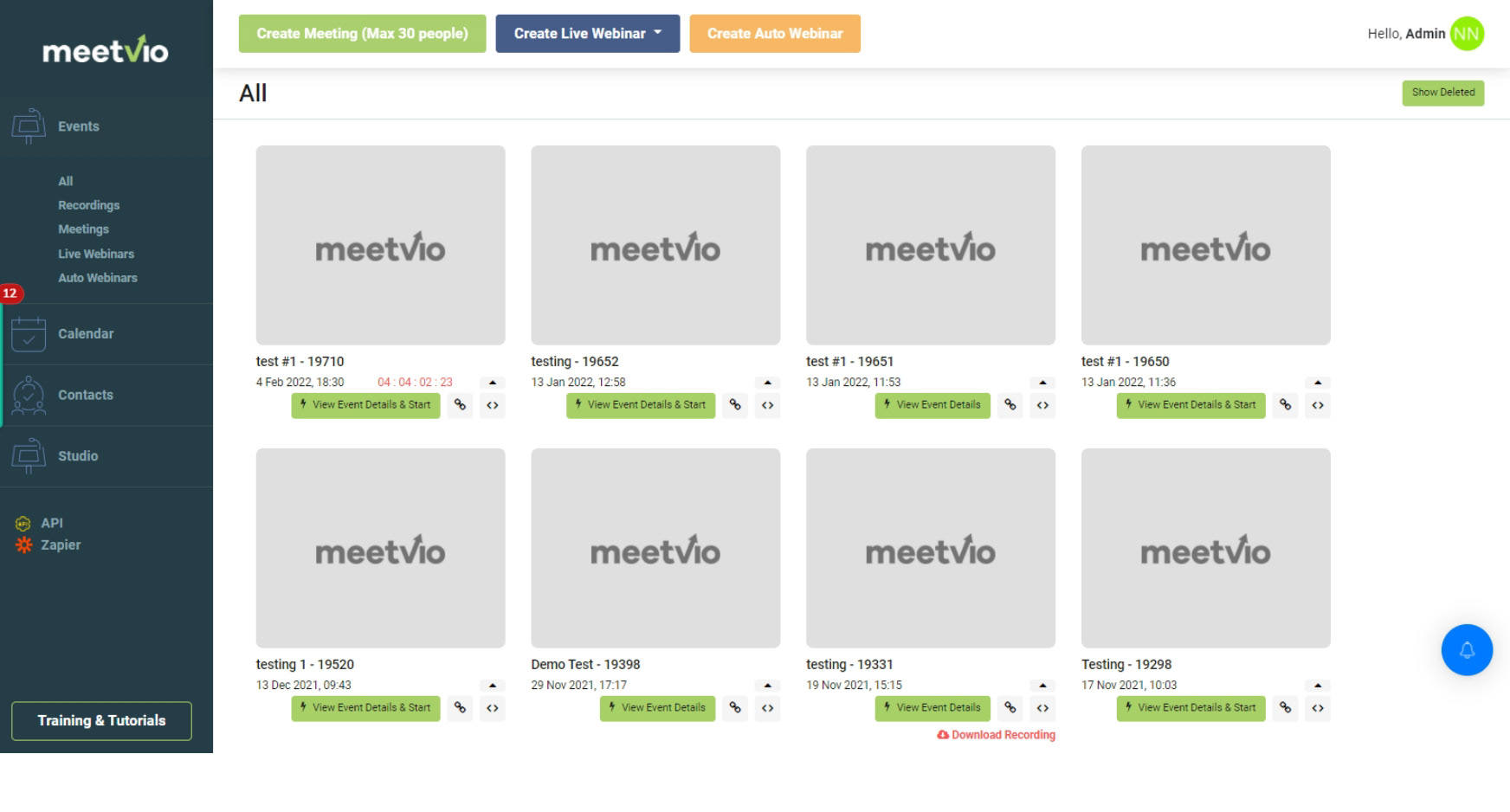
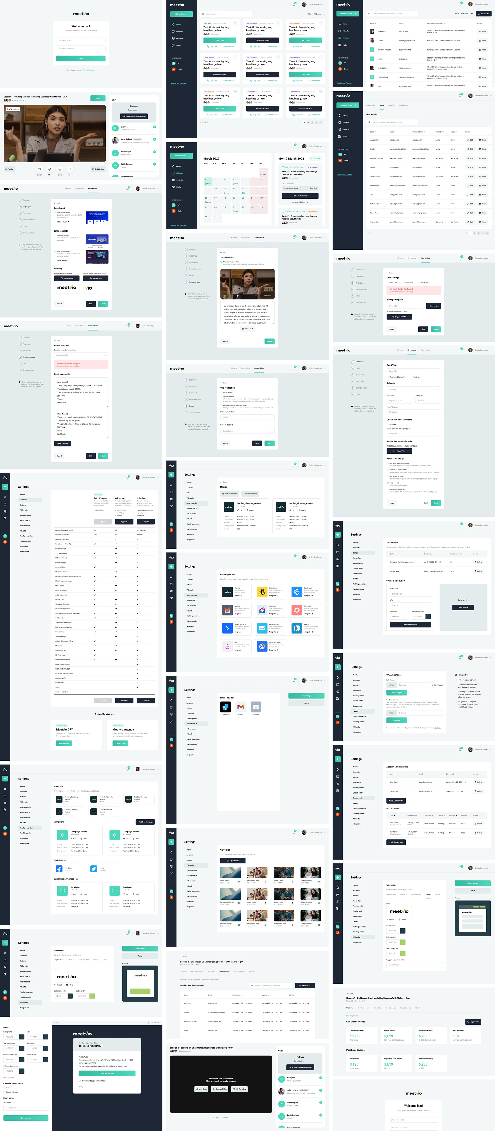
Before
The original dashboard view did not have clarity on the displayed data. The supposed to be thumbnail previews only display the Meetvio logo, and users did not have any information on each card. All the CTAs are compressed in the lower right hand of the card and did not have labels.
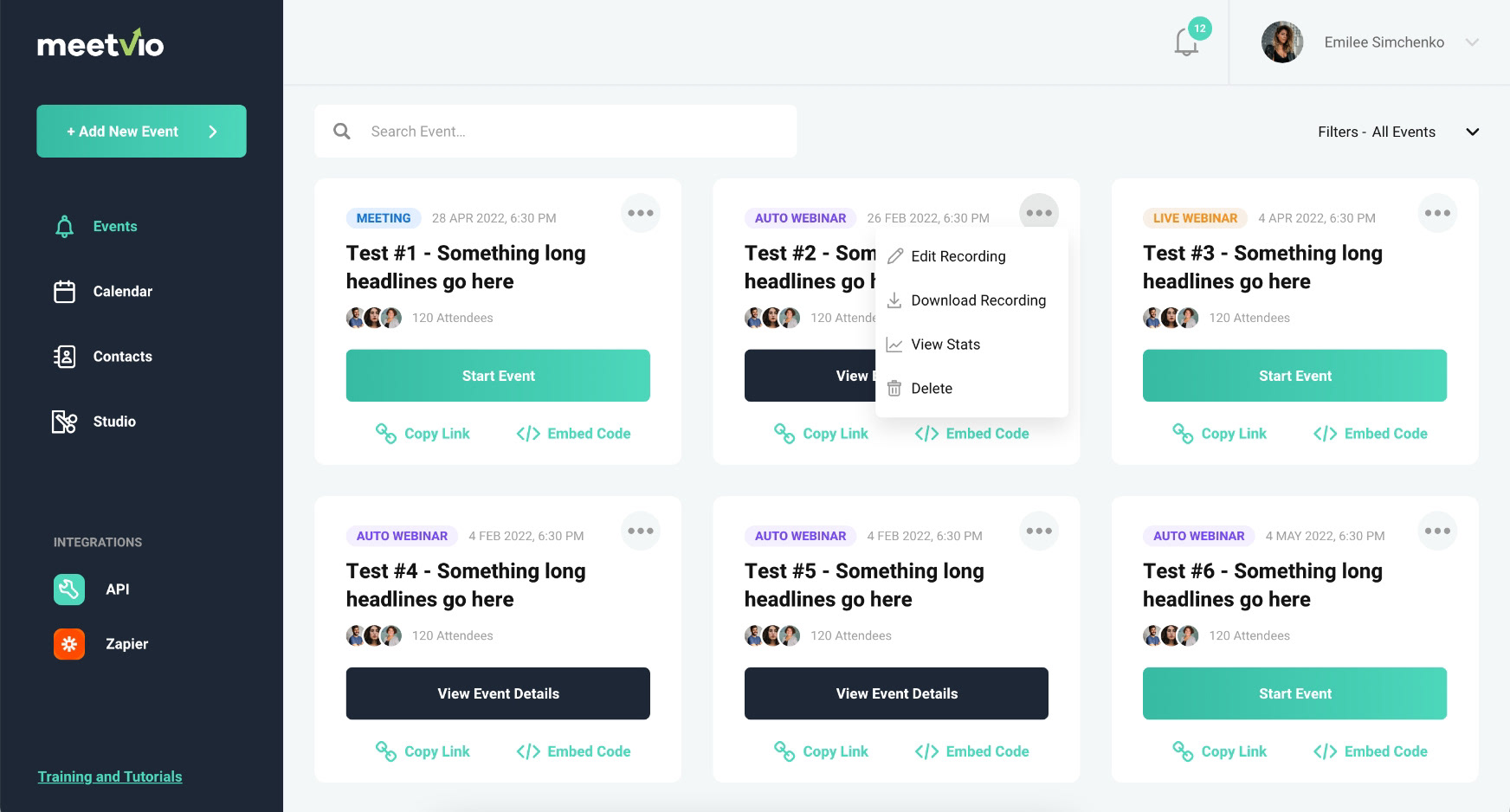
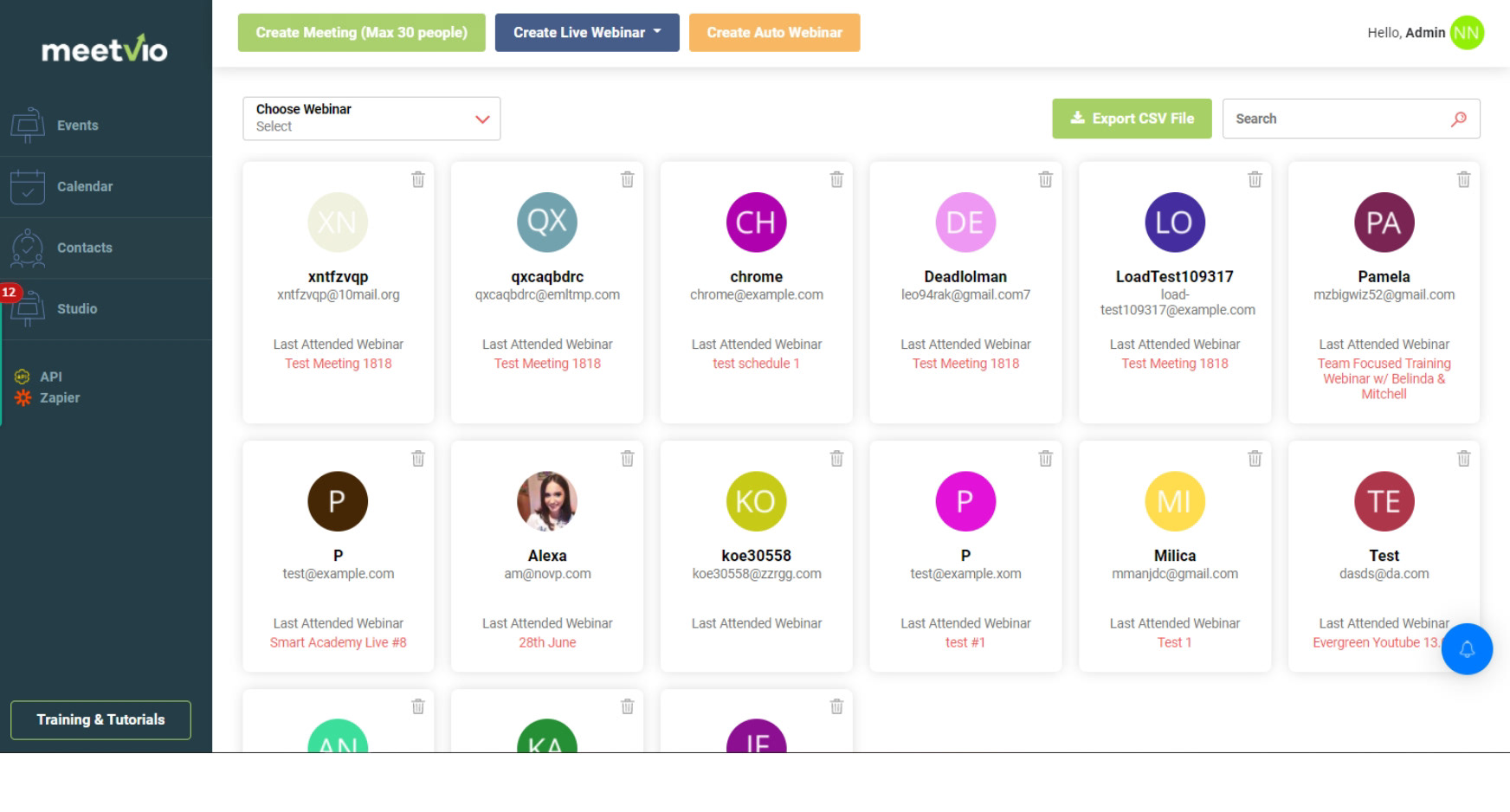
After
I introduced a new dashboard view with better data visualization and information hierarchy. On each card, I’ve added a tag where users could identify the event type, whether it is a meeting, auto webinar, or live webinar. CTAs have been repositioned and clearly labeled beside their corresponding icons. I’ve also added the attendee count to get a piece of information on the stats.

Before
The events in the calendar were shown as cards inside the date box. Multiple events mean multiple cards so users had to scroll through the size of the date box.
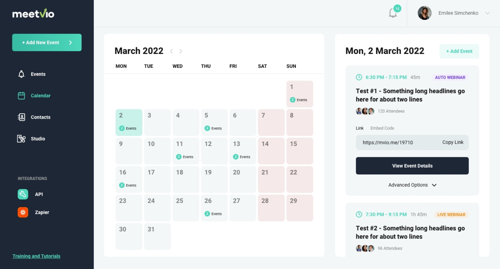
After
I compressed the calendar to accommodate a new section that displays all events for the selected date. Users can now scroll through multiple events easily and now have easy access to the available options such as adding an event for the selected date.
A new iteration is to add a sorting button to sort events by completion or sequence.
Before
The contacts were displayed in a grid view where is it hard to digest the information. The contact images were also given more emphasis than the more important information.
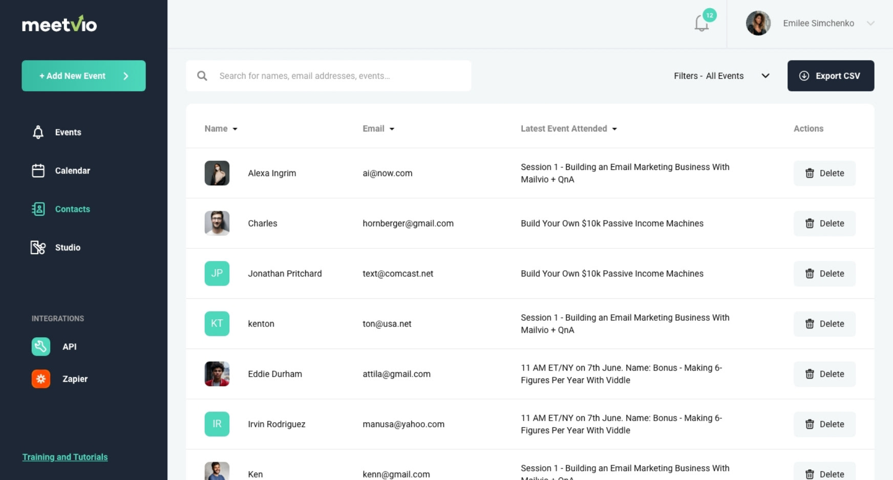
After
I changed the view to list so it’s faster to check through all the contacts. By doing so, we got an opportunity to add a small but very useful function, which is to be able to sort contacts via each category. The delete button has also been given emphasis to lessen user errors.
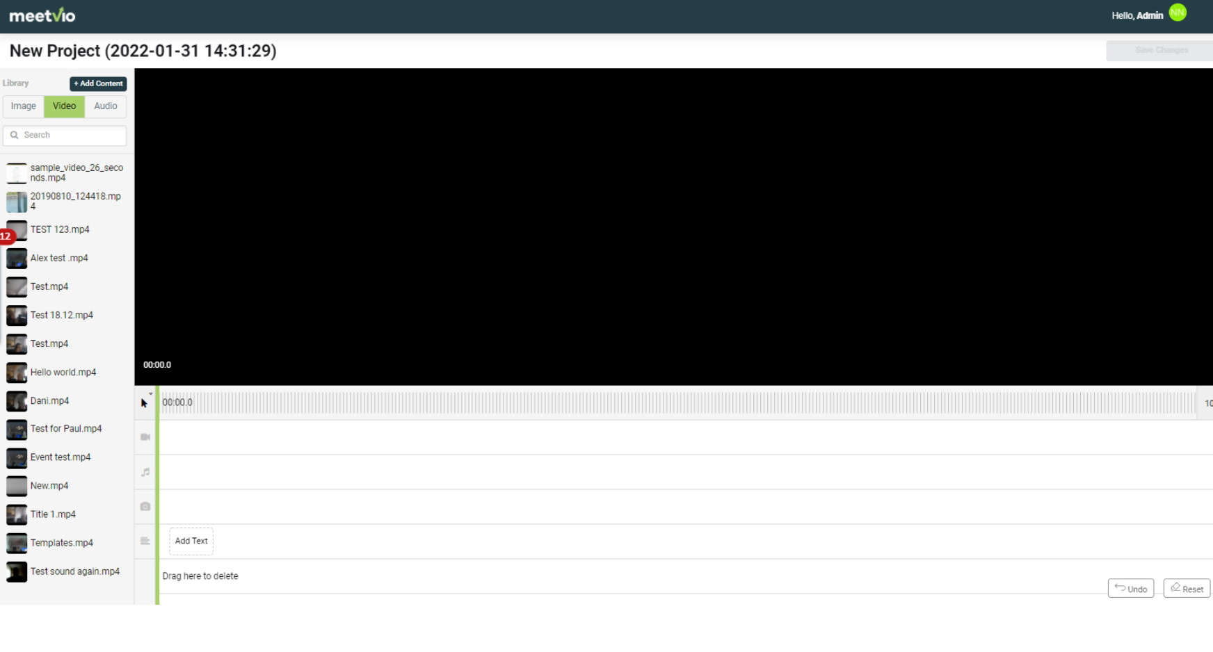
Before
When the event is finished, users can quickly edit the recording using the built-in editor. The editor worked fine but it needed some updates to fit the overall visual design of the product.
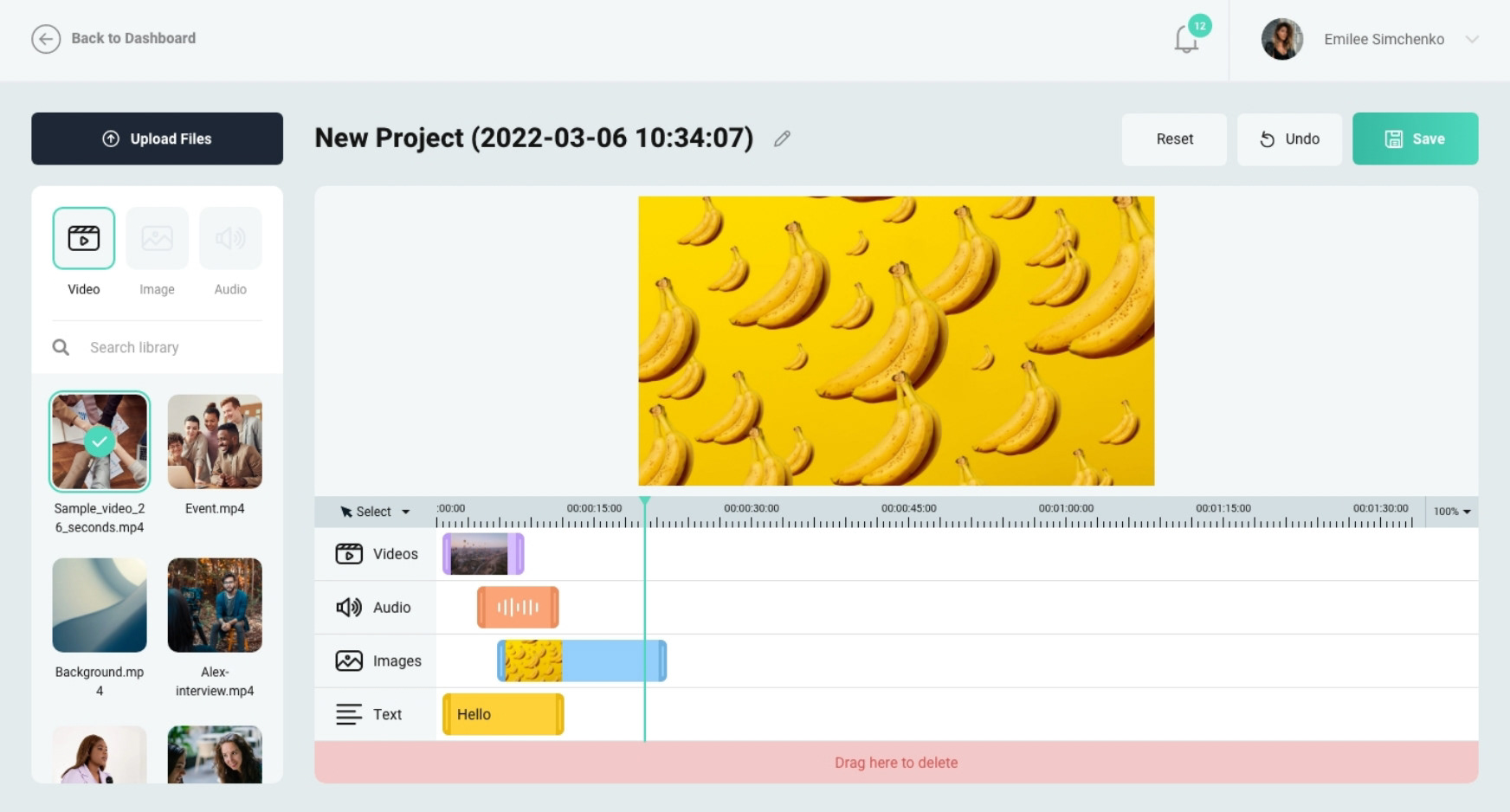
After
I rearranged the left section to make it easier for users to add and sort media files. I added a more accurate timecode so it’s easier to determine how long the media is. Media in the library that have been added to the timeline displays a checkmark.
An iteration is to display all tools such as select and split in a toolbox, unlike the current dropdown we have currently.
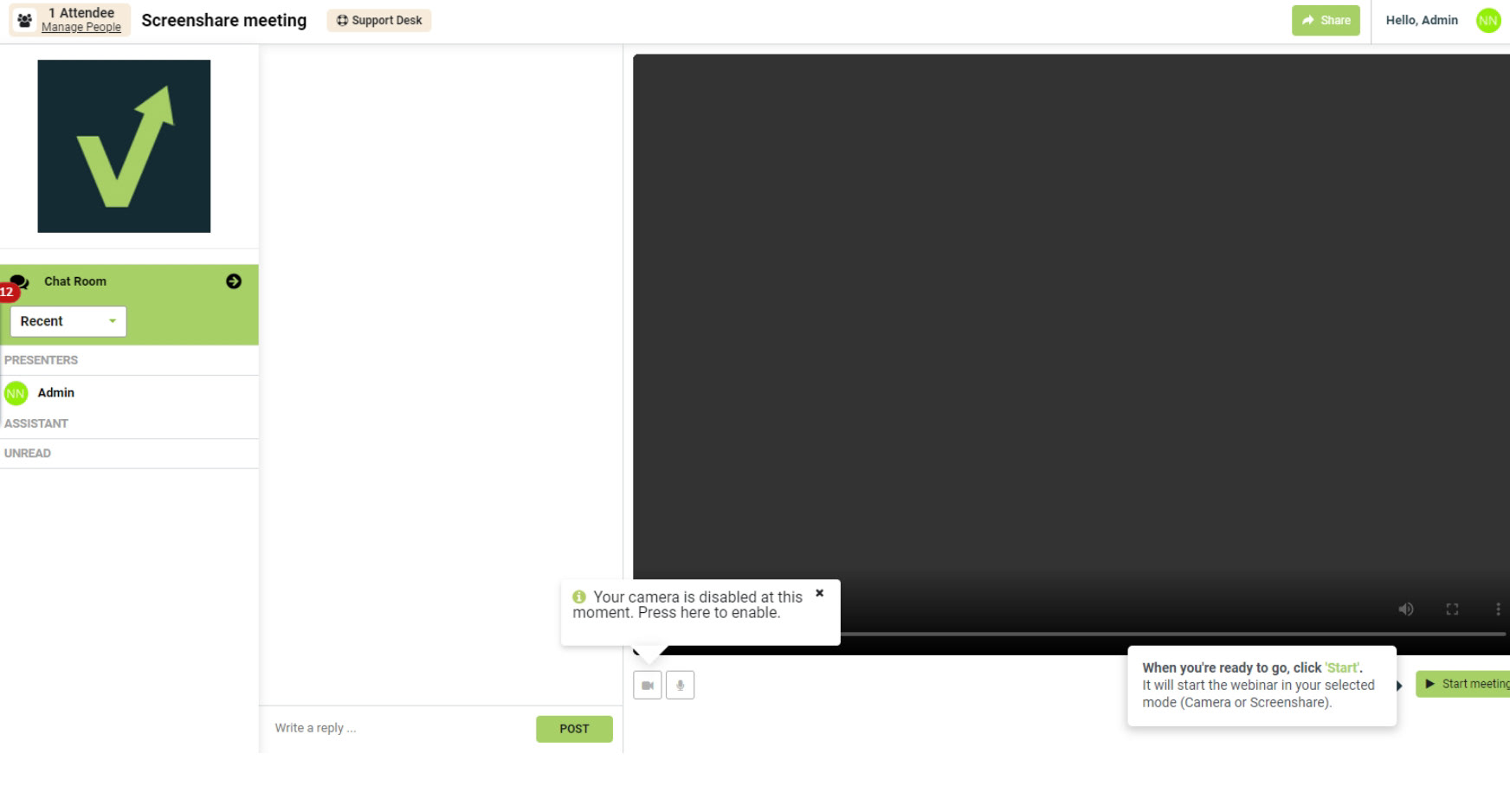
Before
The webinar controls were all over the place and users tend to get confused about what to do next. The chat window takes up a huge space that affects the webinar display.
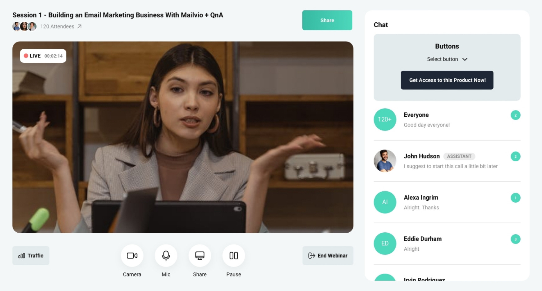
After
I moved the chat box to the right to mimic the commonly used platform for meetings, Zoom. The reasoning behind this is that first-time users can familiarize the dashboard quickly. I also gave emphasis on the webinar controls by introducing huge icons and clear labels. The end webinar button has been moved further away to the right to prevent accidental presses which may interrupt the webinar. Although, there is a confirmation modal when clicked so pressing the button will not immediately end the webinar.
As requested by the product owner, I’ve also added quick access to the on-screen buttons on top of the chat box. The on-screen buttons will be displayed on screen during the webinar for attendees to click. The host can select among the pre-built buttons during the webinar setup. The buttons can serve as buy links, subscriptions, or anything the host may want.
Some more screens